Okay, so my dear temperamental environment worked (mostly) long enough for some decent pictures! Here they finally are, BUT, some still have missing components. The entire bridge also wouldn't show up, as well as most of Madonna's space's exterior views. This is the best I could do.
.
COMPLETED ARCHITECTURE
.
For this scheme and its exploration of power, my main ideas and themes were scale, contrast and inversion. I wanted to present the power of my clients and compliment it in some places, but challenge it in others.
.
.
COMPLETED ARCHITECTURE
.
For this scheme and its exploration of power, my main ideas and themes were scale, contrast and inversion. I wanted to present the power of my clients and compliment it in some places, but challenge it in others.
.
OBAMA'S SPACE
.
Barack Obama's space is where I wanted to explore scale and size. My ideas also led me to consider it amongst its surroundings and how they would work together to present an idea.
.
Barack Obama's space is where I wanted to explore scale and size. My ideas also led me to consider it amongst its surroundings and how they would work together to present an idea.
.
Approaching from the bridge, the grand staircase, high levels and columns loom above you, hopefully invoking a feeling of awe. I looked at the White House and other classical buildings of importance for inspiration, but because of Obama's promise for change, I thought I should invert classical ideas somehow. Hence the collapsing columns, that don't actually hold anything up; literally 'shaking the foundations' of presidential history.
(Picture is missing bottom level walls)
(Picture is missing bottom level walls)
.
The building has a defense briefing room, with miniature 3D maps; one table shows a city, the other, a coastal fleet of ships. A communications room is opposite.
.
Obama's actual office was designed as an expansive podium area. You ascend the stairs and enter the uncluttered room, whose focal point is the US flag and the president's table. The flag behind him represents his nation's legacies, and the panoramic view before him always presents his responsibilities.
(Picture missing glass wall)
(Picture missing glass wall)
.

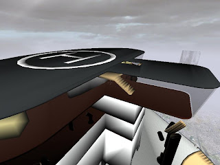
Finally, there is a en extended lookout area where Obama can go purely to look and think, and stairs ascending to a rooftop helipad.
.
MADONNA'S SPACE
.
Madonna's space also represents power through scale, but in a much different way. My central idea here was a building designed to reflect superficial power, and visions of self. Madonna does not have the responsibilies of Obama, attaining power through entertainment and commercial popularity. Thus the first elevator and the entrance is designed as a stage entrance, moving down levels of scaffolding and out onto the stage, where she is always the focus.
.
The view from her office reverses this; it is like a V.I.P booth, where she always has a seat and a great view. From here she metaphorically watches herself and what she represents..
I designed her office to be stepped and more self-enclosed. The attention is on her, and she can ascend and descend levels as pleases.
.
 .
.But 'watching' yourself all day might make you insecure, right? That's where the competitor dartboards come in...
.MEETING SPACE
.
Here is where the contrast comes in. I wanted the meeting space to be a humbling experience. The elevators approach from opposite and equal sides, with an identical walkway and a simple, symmetrical seating area. The view is completely 360 degrees.
(Picture missing glass wall)
.
Here is where the contrast comes in. I wanted the meeting space to be a humbling experience. The elevators approach from opposite and equal sides, with an identical walkway and a simple, symmetrical seating area. The view is completely 360 degrees.
(Picture missing glass wall)
.
 .
. .
.The dining table was the ultimate way to challenge the concept of power. I thought, what if such powerful people could be beaten simply by a table? It has a non-uniform surface with irregularly and annoyingly raised sections, so that you're always paying attention to what you pick up and put down, and where. I wanted to make them always conscious of their own roles, in a situation where they're not in absolute control.
. .
. .
. .
.ELEVATORS
.
Obama's elevator is designed like his office, simple and expansive. The seating makes it resemble a train carriage, with room for plenty of people. It effectively prepares him for the humbling experience of the meeting space.
..
Obama's elevator is designed like his office, simple and expansive. The seating makes it resemble a train carriage, with room for plenty of people. It effectively prepares him for the humbling experience of the meeting space.
 .
. .
.Madonna's first elevator is not her main one. It only serves as a stage entrance elevator, lowered down through scaffolding.
. .
. .
.Her main elevator extends the ideas of her space, like Obama's, but the opposite way. It remains enclosed, with a solitary seat, and sharp protusions, suggesting protection and self-assurance. It does the opposite to preparing her for the meeting space and table.
.
 .
. .
.


